fbpx
Insights

Respond to schools’ needs…

Primary Site


…by being responsive

 
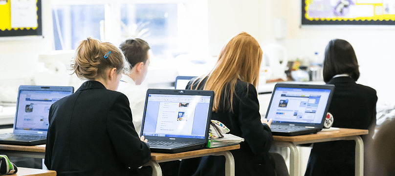
In the last five years, there has been a huge uptake in the use of tablet computers in the UK. Ofcom recently reported that more than half of households now own one, and research by comScore found that we have now reached the tipping point where mobile devices have overtaken desktop computers for internet browsing.
 
The majority of schools we work with tell us that most of their children and families are now tablet and smartphone users, and will favour these instead of laptops and PCs. As a result, schools are increasingly requesting that we make their websites responsive and mobile friendly/compatible.
 
Intuitive and user-friendly
 
First and foremost, schools want to ensure their websites are intuitive and user-friendly. When it comes to being responsive, that means ensuring the text is appropriately sized and spaced, and can adapt to the device, allowing parents to view the information in a way that is tailored to their screen. This means they won’t have to fuss around pinching to zoom in and out, or scrolling endlessly to find the information they’re looking for. If parents can find content quickly and easily, it also reduces the need for phone calls to the school office, saving valuable time for both parents and staff.
 
Socially acceptable
 
Schools are also expressing greater interest in social media, and using these hugely popular platforms to benefit the school. As social media sites are often used by parents on the go, if schools are able to capitalise on them, they can direct users back to the school website for more information. If their site isn’t mobile friendly, they run the risk of existing or even prospective parents becoming frustrated and bouncing straight off the site again.
 
Search engine optimisation
 
Technology giant Google has recognised the importance of search engine optimisation (SEO) and now down-ranks websites that are not mobile friendly, at the same time boosting pages that are legible and usable on mobile devices. If schools are trying to attract more pupils, it could be bad news for their search engine results if the site isn’t mobile compatible. Google uses a special Googlebot (Google’s web crawling bot, sometimes also called a “spider”) for smartphones, which examines websites to see if they match the optimisation criteria, and we see this bot going through the websites we build every day.
 
In addition, the headteacher of a school we’ve worked with in London, St Paul’s and All Hallows Church of England Primary School, Sharon Easton, recently shared with us how optimisation is really useful when she’s out and about too. If, for example, someone asks her a question about the school, she can access and show them details from the website on her own smartphone or tablet. In fact, all staff members have iPads, and because they use the website quite frequently, it allows them to view and update things far more quickly and conveniently.
 
A school’s website provider will be able to optimise their site for mobiles and tablets, if it isn’t already. This may incur a cost depending on the provider, but it is a one-time charge, as no further updates will be required and staff will still be able to upload and change content on the site in the same way.
 
As schools try to keep up with new methods of communication for the increasingly digital world, it’s important to remember that without first ensuring the fundamentals are working as well as possible, any additional effort could be in vain. Luckily, whether your school is trying to engage current parents, or attract prospective ones, very simple changes can make all the difference.
 
To find out more visit PrimarySite.